Customize preorder elements with CSS
Use this guide if the Widget settings don't go far enough and you want full control over how preorder elements look on your storefront. STOQ adds its own class names to every element it injects, so you can target them with CSS. By the end, your preorder button, badge, disclaimer, timer, and modal will match your theme exactly.
Before you begin
| Requirement | Detail |
|---|---|
| Comfort with CSS | You'll write the rules yourself. STOQ doesn't validate them |
| Try the built-in settings first | Button text, colors, badge, and disclaimer all have fields in the offer's Widget section, no CSS needed. See Design the preorder widget |
The CSS field is stored on your shop settings, not on the individual offer. Anything you enter applies to preorder elements across every offer in your store, even though you reach the field from inside one offer.
Add your CSS
On a phone, this menu is collapsed. In the Shopify mobile app, tap the STOQ logo at the top of the screen to open it, then choose the section named below. There is no hamburger icon. See Finding the STOQ menu.
Open the offer editor
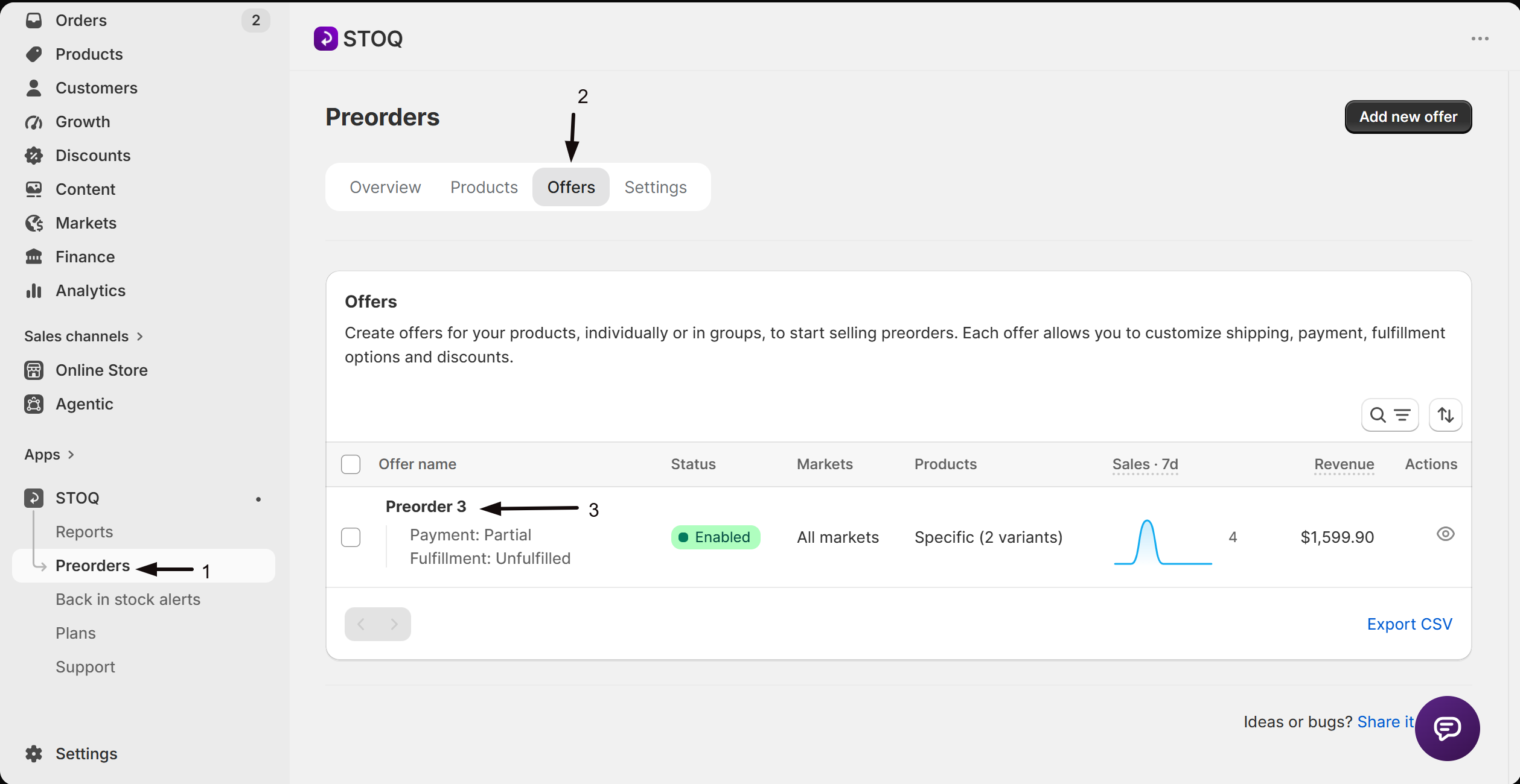
- In the left menu bar of the STOQ app, click Preorders.
- Click the Offers tab.
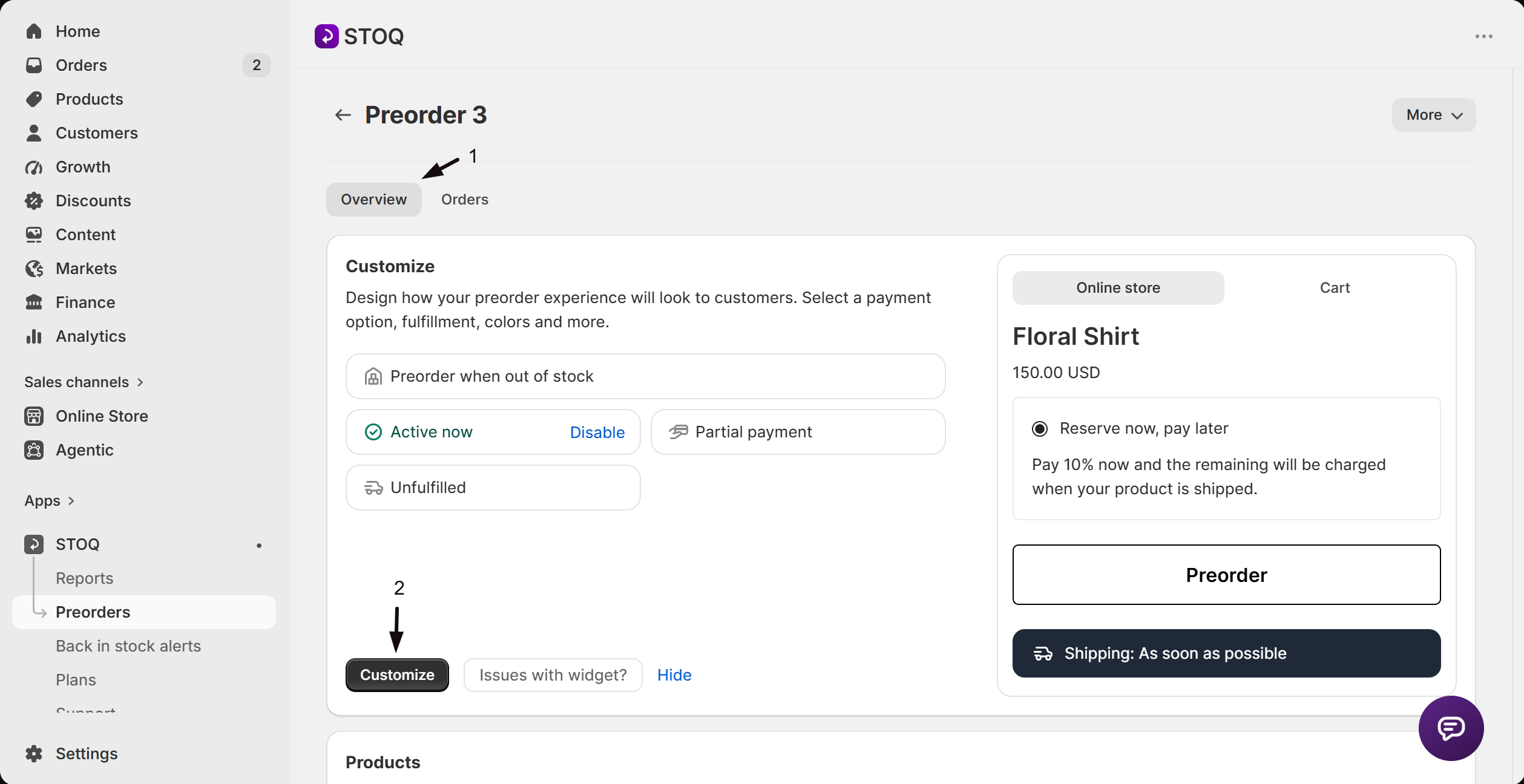
- Click any offer to open its Overview tab.
- Click Customize to open the editor.
Open Advanced
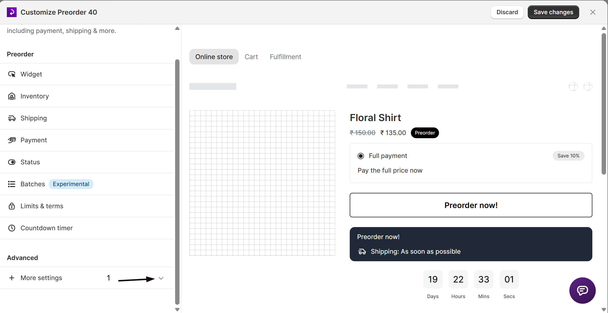
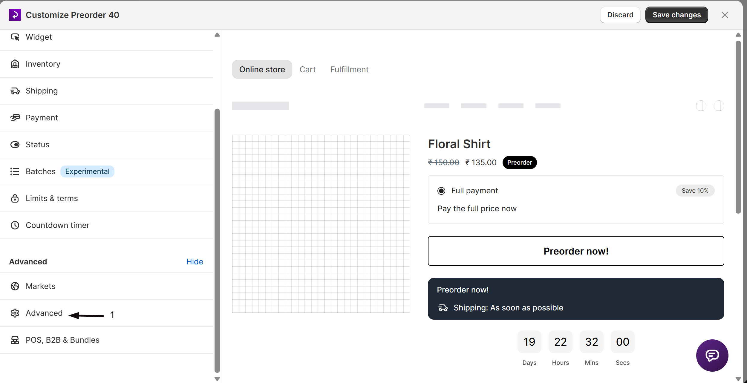
In the settings list, click More settings to expand it, then click Advanced. More settings is collapsed by default, so Advanced isn't visible until you expand it.
Enter your CSS
Scroll to Currency & custom styles and enter your rules in the Custom CSS field.
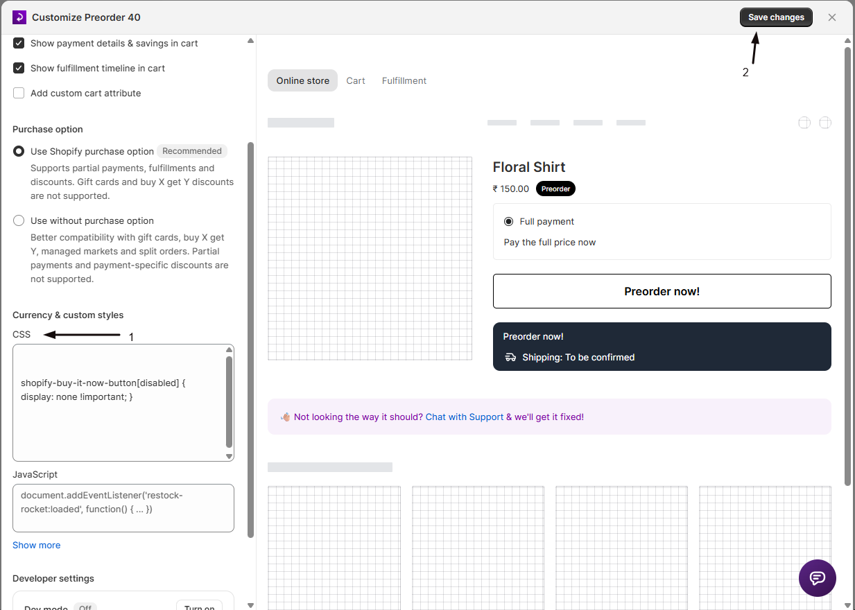
Save and check the storefront
Click Save changes, then open a preorder product on your live storefront and hard-refresh (Ctrl+Shift+R, or Cmd+Shift+R on Mac).
The in-app preview doesn't render custom CSS. The field says so directly: "Save and visit your storefront to check changes." Always confirm on the live storefront.
Selector reference
Product page
| Selector | Element |
|---|---|
.restock-rocket-preorder-button | The preorder button that replaces "Add to cart" |
.restock-rocket-preorder-description | The description text below the button (shipping timeline, payment info) |
.restock-rocket-preorder-badge | The preorder badge near the product title |
.restock-rocket-preorder-countdown-timer | The countdown timer on scheduled offers |
.restock-rocket-preorder-progress-bar | The progress bar showing preorder limit usage |
.restock-rocket-preorder-discount-badge | The discount badge when a preorder discount applies |
.restock-rocket-discounted-price | The discounted price |
.restock-rocket-price-strike | The original price, struck through |
.preorder-detail-text | The shipping text inside the disclaimer box |
.preorder-description-text | The disclaimer text set on the offer |
Payment options
Shown when the offer gives customers more than one way to pay.
| Selector | Element |
|---|---|
.restock-rocket-payment-widget | The whole payment options container |
.restock-rocket-payment-option | One payment option row |
.restock-rocket-payment-input-container | The radio input and its label |
.restock-rocket-payment-input | The radio button itself |
.restock-rocket-payment-title | A payment option's title |
.restock-rocket-payment-description | The description container |
.restock-rocket-payment-description-text | The description text |
Terms and acknowledgement
| Selector | Element |
|---|---|
.restock-rocket-acknowledgement-checkbox | The terms checkbox container |
.restock-rocket-acknowledge-checkbox-input | The checkbox input |
.restock-rocket-acknowledge-checkbox-label | The label beside the checkbox |
Preorder modal
The modal appears when a customer clicks the preorder button and has to confirm. Every modal selector needs the .stoq-preorder-modal parent prefix.
| Selector | Element |
|---|---|
.stoq-preorder-modal | The modal root container |
.stoq-preorder-modal .restock-rocket-wrapper | The backdrop overlay |
.stoq-preorder-modal #preorderContainer | The dialog box |
.stoq-preorder-modal #preorder-header-text | The header title |
.stoq-preorder-modal #preorder-product-info | The product information block |
.stoq-preorder-modal #preorder-product-name | The product name |
.stoq-preorder-modal #preorder-variant-name | The variant name |
.stoq-preorder-modal #preorder-disclaimer-text | The disclaimer text |
.stoq-preorder-modal #preorder-accept-button | The Continue button |
.stoq-preorder-modal #preorder-reject-button | The Cancel button |
.stoq-preorder-modal #preorder-buttons | The container holding both buttons |
Home, collection, and search pages
Every preorder button carries .restock-rocket-preorder-button, so a rule written for the product page applies everywhere. To style one page type only, chain the page-specific class after it:
| Selector | Element |
|---|---|
.restock-rocket-preorder-button.restock-rocket-preorder-button-index | The preorder button on the home page |
.restock-rocket-preorder-button.restock-rocket-preorder-button-collection | The preorder button on collection pages |
.restock-rocket-preorder-badge.preorder-badge-collection | The badge on home, collection, and search pages |
.restock-rocket-preorder-badge.preorder-badge-product | The badge on product pages |
.restock-rocket-quick-add-button | The quick-add preorder button |
Chaining both classes raises specificity as well as scoping the rule, which helps it win against your theme's own styles.
General containers
| Selector | Element |
|---|---|
.restock-rocket-wrapper | The general wrapper around injected elements |
.restock-rocket-wrapper-inline | The inline variant of that wrapper |
.restock-rocket-form-input | Hidden form inputs STOQ adds |
Examples
All examples use !important, because themes often set more specific rules.
Recolor the button, including its hover state
.restock-rocket-preorder-button {
  background-color: #000000 !important;
  color: #ffffff !important;
  border: none !important;
  border-radius: 50px !important;
  width: 100% !important;
}

.restock-rocket-preorder-button:hover {
  background-color: #333333 !important;
}
Restyle the badge
.restock-rocket-preorder-badge {
  background-color: #ff6600 !important;
  color: #ffffff !important;
  font-size: 12px !important;
  padding: 4px 10px !important;
  border-radius: 4px !important;
}
Style one page type only
/* Badge on home, collection, and search pages */
.restock-rocket-preorder-badge.preorder-badge-collection {
  font-size: 10px !important;
  padding: 2px 6px !important;
}

/* Button on collection pages only */
.restock-rocket-preorder-button.restock-rocket-preorder-button-collection {
  font-size: 13px !important;
  padding: 8px 12px !important;
}
Style the countdown timer and progress bar
.restock-rocket-preorder-countdown-timer {
  background-color: #f5f5f5 !important;
  border: 1px solid #e0e0e0 !important;
  border-radius: 8px !important;
  padding: 12px !important;
}

.restock-rocket-preorder-progress-bar {
  border-radius: 4px !important;
  overflow: hidden !important;
  height: 8px !important;
}
Emphasize a discount
.restock-rocket-price-strike {
  color: #999999 !important;
  text-decoration: line-through !important;
}

.restock-rocket-discounted-price {
  color: #e60000 !important;
  font-weight: bold !important;
}
Tidy up the payment options
.restock-rocket-payment-widget {
  border: 1px solid #ddd !important;
  border-radius: 8px !important;
}

.restock-rocket-payment-option { padding: 12px !important; }
.restock-rocket-payment-title { font-weight: 600 !important; }
Restyle the modal
.stoq-preorder-modal #preorderContainer {
  border-radius: 16px !important;
  max-width: 500px !important;
}

.stoq-preorder-modal #preorder-accept-button {
  background-color: #000000 !important;
  border-radius: 8px !important;
}
Hide an element
.restock-rocket-preorder-badge { display: none !important; }Check your setup
Open a preorder product on your live storefront in an incognito window and hard-refresh. Your rules should be visible on the button, badge, or whichever element you targeted. Click the preorder button to check any modal styling.
Troubleshooting
Your CSS isn't showing on the storefront
Work through these:
- Confirm you clicked Save changes after entering the CSS.
- Hard-refresh the storefront (Ctrl+Shift+R or Cmd+Shift+R) to bypass the cache.
- Add
!importantto each declaration. - Check you're looking at the live storefront, not the in-app preview, which doesn't render custom CSS.
Your theme overrides the styles
Themes often use more specific selectors. Add !important, or raise specificity by chaining, for example body .restock-rocket-preorder-button { ... }.
Modal styles aren't applying
Modal selectors need the .stoq-preorder-modal parent prefix. Use .stoq-preorder-modal #preorder-accept-button, not #preorder-accept-button on its own.
A style meant for the product page is affecting collection pages too
Every preorder button carries .restock-rocket-preorder-button, so a rule using it alone applies on every page type. Chain the page-specific class to scope it, for example .restock-rocket-preorder-button.restock-rocket-preorder-button-collection for collection pages or .restock-rocket-preorder-button.restock-rocket-preorder-button-index for the home page. The badge works the same way with .preorder-badge-product and .preorder-badge-collection.
Your CSS applied to offers you didn't mean to change
Expected. The CSS field is shop-wide, not per offer, so it styles preorder elements across every offer. Scope rules to specific products with a theme selector if you need them narrower.
FAQ
Is the CSS field per offer or shop-wide?
Shop-wide. You reach it from inside one offer, but it's stored on your shop settings and applies to preorder elements across every offer.
How do I find a selector that isn't listed here?
Right-click the element on your storefront and choose Inspect to open your browser's developer tools. The panel shows the element's classes, including any STOQ class not listed above.
Can I use animations and transitions?
Yes, standard CSS animations and transitions work. Customers who turn on the "reduce motion" accessibility setting won't see them on the modal, because STOQ honours prefers-reduced-motion.
Can I hide preorder elements with CSS?
Yes, with display: none !important;. For the badge and disclaimer there are proper on/off settings in the offer's Widget section, which is cleaner than hiding them. See Design the preorder widget.
Does custom CSS affect the in-app preview?
No. The preview doesn't render it. Always confirm on your live storefront.
Related guides
Design the preorder widget
Button text, colors, badge, and disclaimer without writing CSS.
Advanced settings
The Advanced section, including the CSS and JavaScript fields.
Show the preorder button on store pages
Control which page types show the preorder button.
Troubleshooting the preorder button
Fix a button that isn't appearing at all.